Archivos: Proyectos
-
Les Oliveres
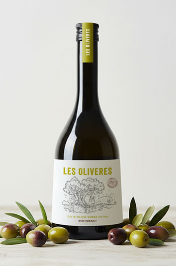
Les Oliveres es un proyecto que nace del amor por la tierra y la recuperación de una variedad de aceituna ancestral. Un proyecto donde la ilustración de Jaume Rovira se convierte en el alma del diseño, acompañada de una cuidada tipografía, colores inspirados en el entorno y pequeños detalles gráficos hacen que todo el conjunto,…
-
EO! EasyOrdering
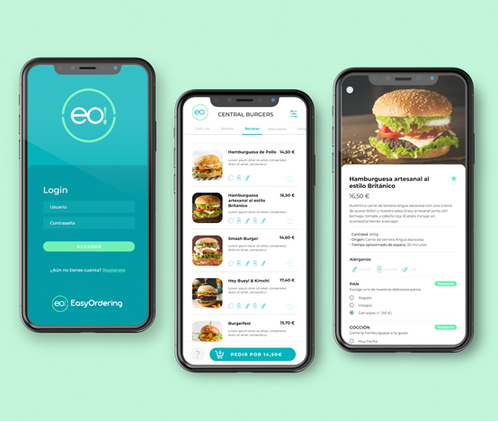
EO!EasyOrdering es una startup que nace con la idea de revolucionar la forma de hacer los pedidos en los establecimientos de restauración.El usuario será el que a través de su teléfono y mediante la tecnología NFC, realizará los pedidos que automáticamente se enviarán al establecimiento, seleccionará el orden y finalmente pagará. Para éste proyecto, se…
-
De mayor quiero ser mochilera

Irene y Roger son una pareja que decidió abandonar su vida convencional y vivir su propia aventura viajando por todo el mundo. Crearon un blog para compartir sus experiencias y actualmente se ha convertido en su fuente de ingresos Acudieron a mi para rediseñar su marca y darle una visión mucho más profesional sin perder…
-
El Corte Inglés

Credit and financial card mobile app, for the renowned Spanish company El Corte Inglés.The development started with an intense previous analysis of the client’s and the users needs. The flow task is necessary to order the sections, understanding the functionalities and possibilities. Then the design was proposed through the main wireframes in order to visualize the flow of…
-
El Bosc Family

Outdoor festival El Bosc Family combines music, food trucks and children’s workshops in a special natural setting in the small town of Riudoms (Tarragona).The whole image: colours, logo and graphic elements, is a reflection of the fun and family character of the event.Besides the branding, I created the image for the social media and the…
-
Vetsalud
La imagen de los centros veterinarios Vetsalud, es un fiel reflejo de su ADN de marca. Además de ser un equipo de profesionales altamente cualificados y comprometidos con los animales, su trato cercano con el paciente y el propietario de la mascota, es uno de sus principales valores. Esto se ve reflejado en todo sus…
-
VitaCress*

This project was made in Master’s degree of Design and Packaging Strategy from ELISAVA Design Center. The brief was to create a new range of fresh and natural products. Some of them positioned in the daily market sector and others focused on the gourmet market. This project was selected for Behance Porfolio Reviews 2013. Proyecto realizado…
-
Entramat

The Montsant DO is an area of great geological diversity. Combined with the climate, it forms a perfect blend of ingredients that give the vineyards their unique character.The label, together with the name of the wine, wants to share this perfect elements mach. They mix and cross it to create something unique. La zona geográfica…
-
HISA, house finder
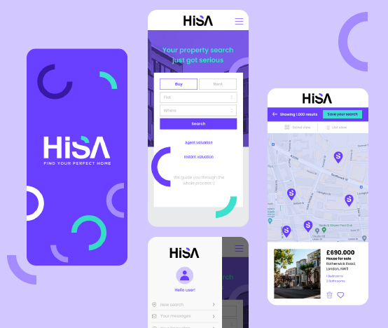
This is the final project of the UI DesignLab course. Throughout this course, we had to follow the steps of a usual user interface design method. Starting with a task flow diagram, wireframes, high fidelity mockups and prototypes with Figma. Proyecto final del curso de UI Design en DesignLab. A través del curso, hemos seguido…
-
Naturel eCommerce

eCommerce design for Naturel brand. It follows the same design guidelines as their branding and packaging, honest and natural. Propuesta de diseño para la tienda online de la marca Naturel. Sigue una línea la misma línea de diseño establecida por su branding y packaging, honesto y natural.
-
Orios Olive Oil
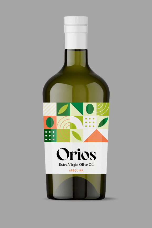
The design inspiration comes from geometry and combines raw material, earth and climate. The result is a fresh and dynamic organic olive oil. Nueva gama de aceites de oliva de origen Mediterráneo. El diseño evoca a través de la geometría, la tierra, el clima y la materia prima; un aceite de oliva orgánico fresco y…
-
Almudena Curto

Almudena Curto’s brand identity, transmit serenity, confidence and a world where emotions and insight knowledge are the priority. For this reason, her website design follows a fresh and peaceful style. It’s clear and intuitive and users are able to follow all the steps until they get to contact with the psychologist. La identidad de marca…
-
Ajuntament del Perelló
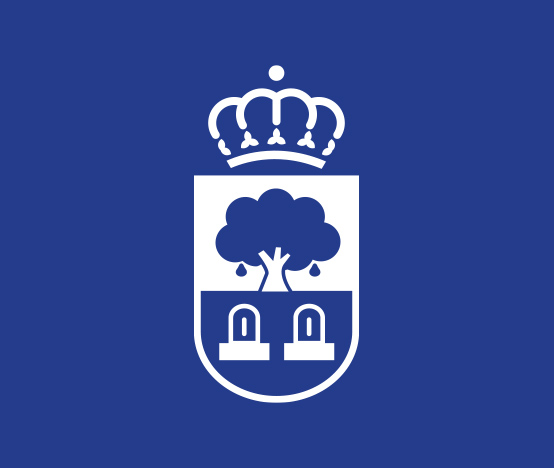
El Perelló is a small village in the south of Catalonia.However their city council image has become a little obsolete over time. This project started with a study of the village’s heraldic history, and there are three key elements: the pear tree, the water and the fountains. These elements were simplified to update them without…
-
Bimbo Bagels

La nueva propuesta de imagen para los Bagels de Bimbo, se dirige a un target «joven adulto» que está al día de las nuevas tendencias, que le gusta cuidarse e innovar en sus desayunos. Por eso en ese diseño se combina lo nuevo con lo tradicional y la garantía de la marca.
-
Medical Admin

Medical Admin is an online platform which allows health professionals to get in touch with medical centres who offers their services (consultations, work material, reception finance services…).Throughout the website, health professionals may register and search medical centres close to their zone and choose the ones adapted to their needs. At the same way, medical centres…
-
Leite Açores
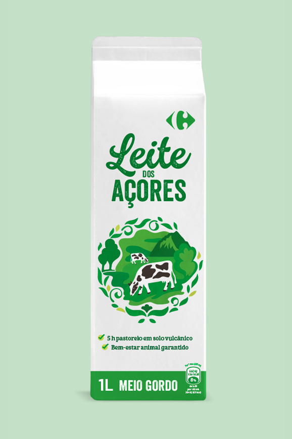
Diseño e ilustración para la leche de la marca propia de Carrefour, procedente de las islas Azores, donde las vacas pastan en libertad en una tierra de suelo volcánico que dota a su alimentación de una característica, cosa que hace que su leche sea única. Design and illustration for Carrefour’s own brand milk, from the…
-
Kenta Coffee

Creación global de naming, branding y packaging para Kenta cafés. Naming, branding and packaging for Kenta coffees
-
Águila Negra

Craft beer brand from Asturias. The naming and the taste of the beer inspires to create a rough image around the world of lettering and tattoos. This world was created using contrast design elements such as white and back colours or opposite typographies. La imagen de la cerveza Águila Negra, refleja su cuerpo y carácter a…
-
Naturel
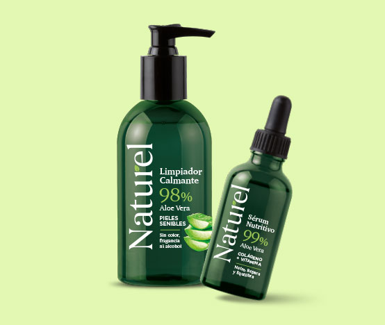
This is a cosmetic natural brand, based on Aloe Vera. The product it’s made with super natural ingredients and therefore the packaging and branding design are honest and natural. Creación global de productos cosméticos naturales a base de Aloe Vera y otros productor naturales. La imagen de Naturel transmite la transparencia del producto mediante un…
-
Cleeko
Cleeko it’s a technology star-up specialized in providing digital management and appointment solutions. The brand image, is inspired by the digital “click” that customers make on their mobile phones to access the virtual queues of establishments. Colours were chosen to create contrast and to be close to the technology world. Cleeko es una start-up tecnológica especializada…
-
Wondas
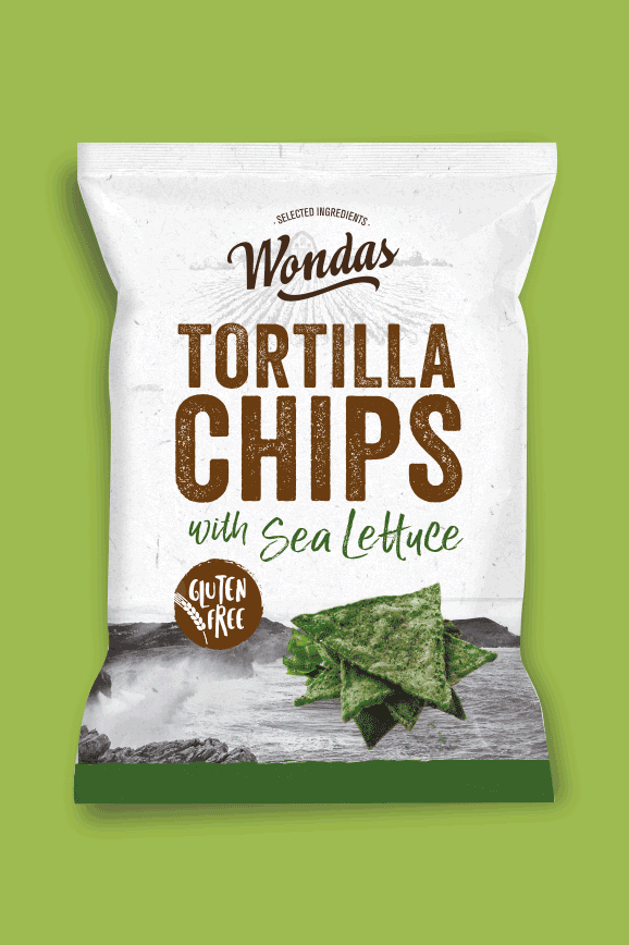
Para este diseño de branding y de packaging, se quiso salir del tradicional mundo mexicano, al cual suelen pertenecer los productos de esta categoría.
-
Flor Elixir

Flor Elixir nace de la necesidad de la marca Flor, de crear una subgama más premium. Mediante los diferentes elementos del packaging y del branding, se ha creado una magia alrededor del producto que transmite mediante la gráfica visual, sus características aromáticas. Proyecto realizado en Batllegroup
-
Ritual Color
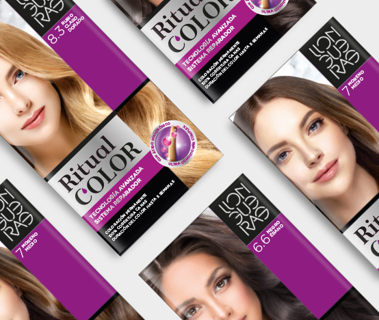
Llongueras is a hair care brand from one of the most popular hairdressers in Spain. Ritual Color was the proposal for their hair care colour products. The geometric structure across the packaging, was created to allows a good harmony and the perfect hierarchy throughout the design. The biggest concern was to be able to integrate the…
-
Satírico

“Érase un hombre a una nariz pegado, Francisco de Quevedo The brief was to create something between literature and wine. The chosen text is from one of the most famous noble and Spanish writers called Francisco de QuevedoHe wrote this poem in honor of the nose and it was fun to link the smell and wine,…
-
Radiòlegs de Catalunya

Radiòlegs de Catalunya is radiology specialists community from Catalonia. They had a very obsolete design with the Catalan flag. The inspiration here was to show the skeleton of the letters like radiologists can see our body across radiology. The colours are also close to their radiology world. La sociedad de radiología Catalana, necesitaba un branding claro y limpio que…
-
Flor Pure

Flor Pure es una gama de suavizantes de fragancias básicas para el uso diario. El packaging transmite frescor y pureza en el aroma manteniendo las connotaciones de la marca Flor.
-
Dérive
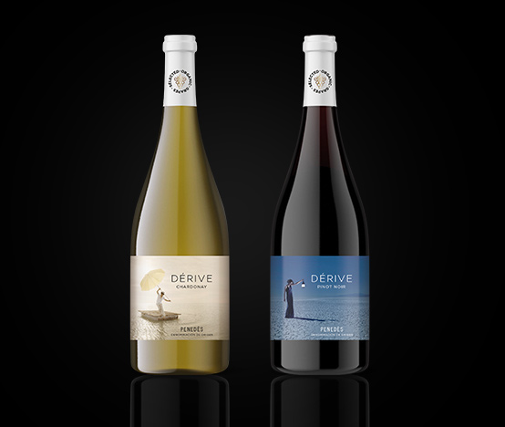
Diseño y naming para unos vinos del Penedés, que evocan un paisaje onírico a través de unas imágenes que llevan al consumidor a un mundo mágico y de sueños.
-
Esarq

Material promocional para la escuela de arquitectura Esarq Uic, donde se utilizan los dibujos de los propios alumnos para ilustrar los diferentes soportes gráficos. Proyecto realizado en Eva Estudi